Drapery Fabric Basics: Weight, Light Control, and Fade
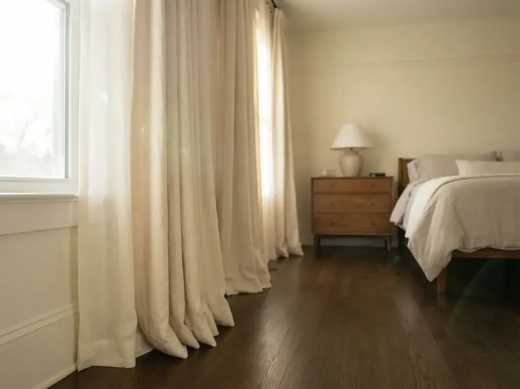
Custom drapery is not cheap, and a fabric or color mistake is expensive to live with once panels are sewn and hemmed to a specific window. A short list of questions before you order saves most of that regret, and none of them require any special expertise to ask.
Fabric Weight and How Drapery Falls
The mistake we see most often is ordering a lightweight fabric for a window that gets opened and closed by hand every day. Light fabric snags on rough hardware, and it shows finger oil and wear at the leading edge within a year in a way heavier weaves don't. If a panel is going to get handled daily rather than left open, weight and weave tightness matter more than the swatch color.
Another problem shows up on wide windows. A single width of lightweight fabric on a window wider than about four feet can look skimpy no matter how much fullness you order, because thin fabric doesn't hold a fold, it just falls flat between the pleats. That's a case where either doubling up on fullness or moving to a heavier weight fixes it.
We've also seen fabric ordered without checking how it performs once it's actually hung. A swatch lying flat on a table tells you almost nothing about drape. Ask to see a full hank, at least a yard, held up vertically, before committing a whole Avon window to it.
Fullness and the Hardware Behind It
Ask what fullness ratio the estimate is actually built on, since "full" gets used loosely and can mean anywhere from one and a half to three times the rod width depending on who's talking. Get the actual number, and compare it against the fabric weight. Heavier fabric generally looks right at a slightly lower fullness than a sheer or lightweight fabric needs.
Ask about the rod's weight rating in pounds, not just its finish or diameter. A rod that looks substantial can still be rated for a fairly light load if it's mostly decorative, and that number matters more than how it looks in a showroom display.
And ask whether center support is included on wide spans, and at what width it kicks in. For an Avon window running much past six or seven feet, that's not an optional upgrade, it's what keeps the rod straight and the panels gliding evenly for as long as you own the drapery, so it should be part of the base quote rather than something added after the fact.
There is no substitute for asking these questions out loud with someone who installs drapery for a living. A free in-home measure at your Avon address is a practical place to start, whether you already have a fabric picked out or you are still narrowing things down.
Color and Sun Exposure
Dark, saturated colors, think navy, hunter green, rust, or a deep charcoal, tend to show two things a lot of people don't expect: dust and fading. Dust shows up as a dull haze on dark fabric that's much more visible than it would be on a mid-tone, and fading on a dark color often shows as an uneven patch rather than an overall lightening, especially where direct sun hits one section of the panel more than another.
Pale, soft colors have the opposite problem. They show soiling at the leading edge and along the bottom hem, where hands and floors touch the fabric, faster than a mid-tone would. Neither issue is really about color itself, it's about how visible normal wear is against that particular shade.
For an Avon window with strong afternoon exposure, a mid-tone with some texture in the weave hides both problems better than a flat, dark solid or a very pale one. And regardless of the shade you land on, understand that sun exposure gets slowed with lining and UV-resistant fiber, never stopped outright.
Light Control and Lining Options
Lining does two main jobs: it controls how much light comes through, and it protects the face fabric from daily sun on the back side. It also gives the panel a cleaner look from the street, since passersby otherwise see the underside of the fabric's seams. Standard cotton sateen lining knocks down glare and adds a bit of privacy without going fully dark.
Blackout lining is a different animal, usually a foam-coated or knit-backed layer bonded to the lining that blocks nearly all direct light through the fabric itself. The word "nearly" matters. Drapery isn't built into a sealed track the way a cellular shade is, so even a true blackout panel lets a strip of light leak in around the edges and at the top where the rod sits.
If a bedroom needs the room fully dark, we usually pair blackout drapery with a shade mounted inside the window frame behind it, rather than relying on the drapery panel alone to seal the room. For most Avon living rooms, a middle-weight lining is the right call, enough body and light control without turning the room into a cave.
Pattern and Texture
Look at what's already patterned in the room before adding more pattern at the window. A room with a patterned rug and patterned upholstery generally needs a solid or textured drapery, otherwise everything competes for attention and the room feels busy rather than layered. A mostly neutral room, on the other hand, has room for the window to be the pattern statement.
Scale should relate to the size of the window and the room, not just personal preference. A tight, repeating small print can look almost like a solid from across the room, which works well in a smaller Avon bedroom where a huge bold pattern would feel like too much. A great room with high ceilings and a big expanse of glass can carry a much larger scale print without it feeling overdone.
Texture is worth leaning on in rooms that already have a lot of hard, smooth surfaces, tile floors and large expanses of glass, for instance. A slubby linen or a nubby weave softens a room like that in a way a flat, smooth solid fabric doesn't.
Frequently Asked Questions
How do I know if a fabric is heavy enough for my window?
There is no single number that works for every window, but as a rough guide, anything under about six ounces per yard is going to move a lot and probably wants lining behind it for body. Wider windows and taller ceilings generally look better with a heavier, more structured fabric, while smaller windows can carry something lighter without looking skimpy.
Should I pick the fabric first or the color first?
Fabric type first, in most cases. The fiber content and weave affect how any color actually reads once it is hanging, sometimes softer, sometimes more saturated, so choosing color against a specific fabric sample is more reliable than picking a color in the abstract and hoping to find it in the right weight and construction later.
Do darker colors really show more wear than lighter ones?
They show different wear, not necessarily more. Dark, saturated colors show dust and uneven fading more visibly than mid-tones do, while very pale colors show soiling at the leading edge and hem faster. A mid-tone with some texture in the weave tends to hide normal daily wear better than either extreme.
 Bay and Bow Window Shades: An Avon Homeowner's Guide
 Window Treatments That Actually Hold Up in an Avon Bathroom
 How to Measure Your Own Windows for Blinds or Shades